 |
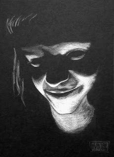
| Photo is author's own |
What happens from there depends on you level of tolerance
and self-control. Some of us instantly close the tab and block the trauma from
memory. Others ignore it and continue to enjoy the content of the page despite
the screaming pet peeve alarm. You can probably guess which camp I’m in.
So after a quick survey on Twitter and reviving repressed
trauma (the things I do for you guys), I have compiled a list of five ways to
make your readers run from your blog faster than a cat from a bubble bath.
Ready?
Go!
- Really long paragraphs. Readers like short paragraphs, especially online. Why? Honestly, it’s just easier to read. It’s light on the eyes and it feels faster while you’re reading. Not to mention the increase of reading on mobile devices. Ever try to read a long paragraph on a cell phone? Not pretty.
- Light text on dark backgrounds. People tend to make this mistake because they think it looks cool. You know what’s cool? Being able to read without feeling like the words are glaring at you.Don’t believe me? Let’s do a quick experiment. Which is easier to read?This gorgeous neon text on awesome black background of emo-ness?Or this normal black text on a light background?It doesn’t look cool, ok guys? It drives readers away from your blog en masse.
- Teenie, tiny font size. This is hard to read. If your blog looks like this, you're giving some poor far-sighted person a migraine. Worse—you’re making normal people squint and feel like they need glasses. Make your font bigger. Like, at least 13 (though I’ve read that font size should really be larger than that, so I’m being nice with 13). Larger font = happy readers.
- Auto-playing music. I know why people do this, really I do. Setting the atmosphere of your blog with some music sounds like a good idea. But guess what? Some people like to listen to their own music while browsing the web, then when the auto-playing music starts playing all of a sudden two songs are playing at the same time fighting for your attention and I don’t know about you guys, but I go crazy finding the tab to SHUT OFF THE FOREIGN NOISE.You know, so I can listen to my music in peace.Then there are other times when music just makes reading difficult. The idea is to appeal to as many readers as possible, and playing music is a guaranteed way to alienate some readers. I’m not saying they’ll all care (there are plenty of people, I’m sure, who don’t really mind), but there will be some who leave just because there is music playing. And you really don’t want that, now do you?
- Terrible spelling and grammar. I have a feeling this annoys writers more than anyone else, but numerous grammar and spelling errors on a blog makes it look highly unprofessional. I’m not saying the occasional typo will kill you (it won’t, we all understand you’re human), but when your blog reads like a 14-year-old’s text message, there’s a problem.
What are your worst blog or web design pet
peeves?


12 comments:
Well, there goes MY redesign...
lol I like your blog design! It looks very clean and professional. :)
Yeah but I was going to have it blast Motorhead's "Ace of Spades" when people visit. And animated gifs of flaming skulls and shit.
My blog posts are getting shorter the more I write. I used to think they had to be long to get the proper bang for the buck... then I realized, what buck? The reader's time? Length is not the answer.
lol on a black background with tiny font?
I'll occasionally have a longer post here and there, but I definitely try to aim for shorter.
I'm thinking a big honkin' uncompressed PNG with black and dark silver filigree.
Perfect! That'll scare all of your readers away for sure! (That's what you were aiming for, right? :D)
Oh god yes.
Then your victory is surely at hand.
Purple text against green background and some other seizure-inducing clashing colors!
Ah yes...those clashing colors are just fabulous on the eyes, aren't they?
Post a Comment